The Box Model for Design
Everything on the web is structured using the box model. HTML elements (e.g., paragraphs, div blocks, sections, etc.) are expressed in boxes. By default browsers stack these elements vertically, like boxes on top of each other. Through the use of modern CSS features we can organize and position these boxes in a range of ways to achieve the diverse range of layouts on the web today.
What is the Box Model?
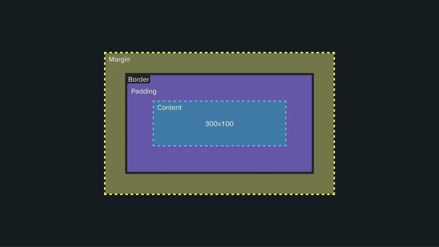
When we talk about the box model we’re referring to the way in which the browser understands what an HTML element is. There are 4 major sections of the box model: content box, padding box, border box, and margin box. In order to understand the amount of space any element takes up on a web page the browser combines all of these values and computes the box that needs to be placed on the page.
Content Box
The Content Box is the area in which your content is displayed. This area can be sized using properties like inline-size and block-size, or width and height.
Padding Box
The Padding Box is created and calculated by taking the content box and applying additional white space around it. This is controlled using the padding properties.
Border Box
The Border Box wraps around the content and padding. The border properties are used to style this.
Margin Box
The Margin Box is the outermost layer of the box model, it wraps the content, padding, and border with additional white space. This property is often used to separate elements on a page. This is controlled using the margin properties.
What is box-sizing: border-box?
It’s common to see some version of the * { box-sizing: border-box} style on websites these days.
The default styling mode for HTML elements is content-box. The content box does not take the padding or border of an element into account when sizing itself. Under the content-box model we need to manually account for padding and border when sizing an element.
Due to the nature of the web, and the desire to maintain backwards compatibility the default model used by elements is not likely to change any time soon.
In an effort to resolve these issues, the “alternative box model” was coined. By setting the box-sizing attribute of an element to use border-box the padding and border are included in any specified dimensions (inline-size, block-size, width, or height).
The * selector is known as a “wildcard” selector, it will match all elements. This style forces all elements within a webpage to use the alternative model, behaving how most designers and developers have come to understand.
How the Web Uses Boxes
All HTML elements are expressed in boxes on the web. You can imagine an invisible boundary around each element, which contains that element within a box. You can style elements and create layouts using these invisible boxes; adding space within a box’s bounds using padding, between elements using margin or gap, or add a visual border to an element’s box. Depending on the layout style and CSS properties these boxes can sit next to or stack on top of one another.
Web layouts behave like a text document, where content flows naturally from the top-left of the page, then moves to the next line (i.e., wraps) when it hits the right-side boundary of the document. The content is responsive because the content conforms to different resolutions.
For instance, if you resize a text document window, the content layout will adjust accordingly, without decreasing the size of the content. Similarly, when resizing a browser window the content does not remain static and shrink or scale, it will adjust it’s positioning based on how much available space there is before wrapping to the next “line”.
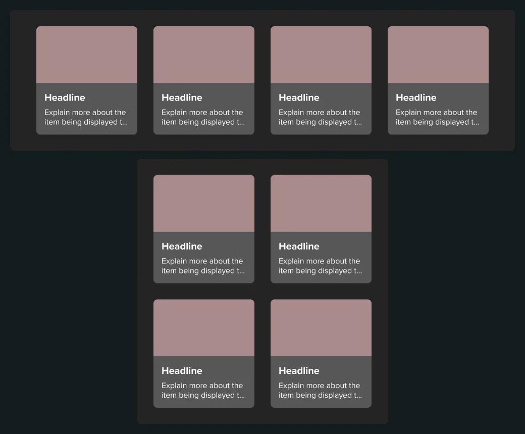
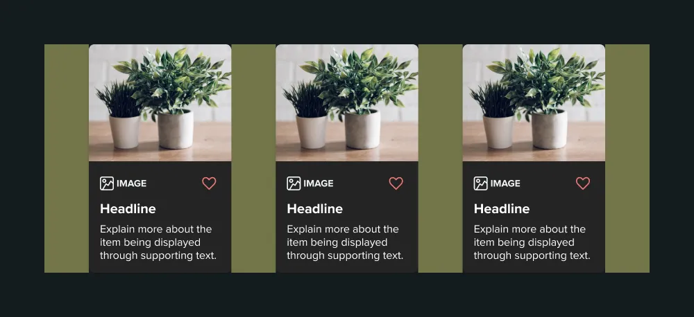
Nesting Boxes to Build Components and Layouts
A core principle to understand when it comes to web design and the box model is that boxes can nest inside other boxes. This allows designers and developers to place elements inside other elements in order to group, align, and style related content.
In the example above you can see an image, title, description, and button and their boxes nested inside another element’s box in order to create a generic “card” style component.
Understanding Spacing Within and Around Boxes
By default, when the contents of a box increase, the size of the box increases too. That means there’s usually no need to set defined heights on elements — instead, you can let the content determine the height. For instance, if you have a heading and paragraph element inside of a container element, the container’s height is determined by the heading and paragraph elements.
You can also create spacing between elements and within elements with margin, padding, and gap.
Margin
Margin creates space outside of a box, pushing other boxes away from itself. Margin is most often used to create space between elements, it used to be a mainstay for layout design but has been replaced in many instances and layouts by the use of flexbox or grid along with the gap property.
There are multiple quirks with margin that come from the typesetting and document layout origins of the web such as margin collapsing. Josh Comeau has written an incredibly detailed deep-dive into margin collapse over on his website.
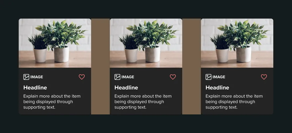
Padding
Padding creates space within a box, between the box’s borders and contents. There are some scenarios where a desired effect may be achieve with padding in lieu of margin. If you want multiple elements to butt up next to each other, but do not want the content of those boxes to touch, you would use padding to add additional space between the edges of the box and the content areas.
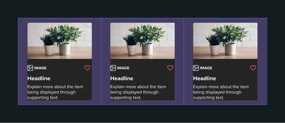
Gap
Gap is a relatively newer property that must be used in conjunction with the flexbox or grid CSS layout styles.
Similarly to margin, gap creates space between elements. However, the gap property is set on a parent element and only applies between the child elements. If you have 3 elements in a row setting an inline margin on those elements will apply space to both the left and right sides of the elements, including the outside of the first and last element. Gap on the other hand, when set on the parent container will only create space in-between the 3 child elements, with no additional space on the outside of the first and last elements.
The Box Model in Figma
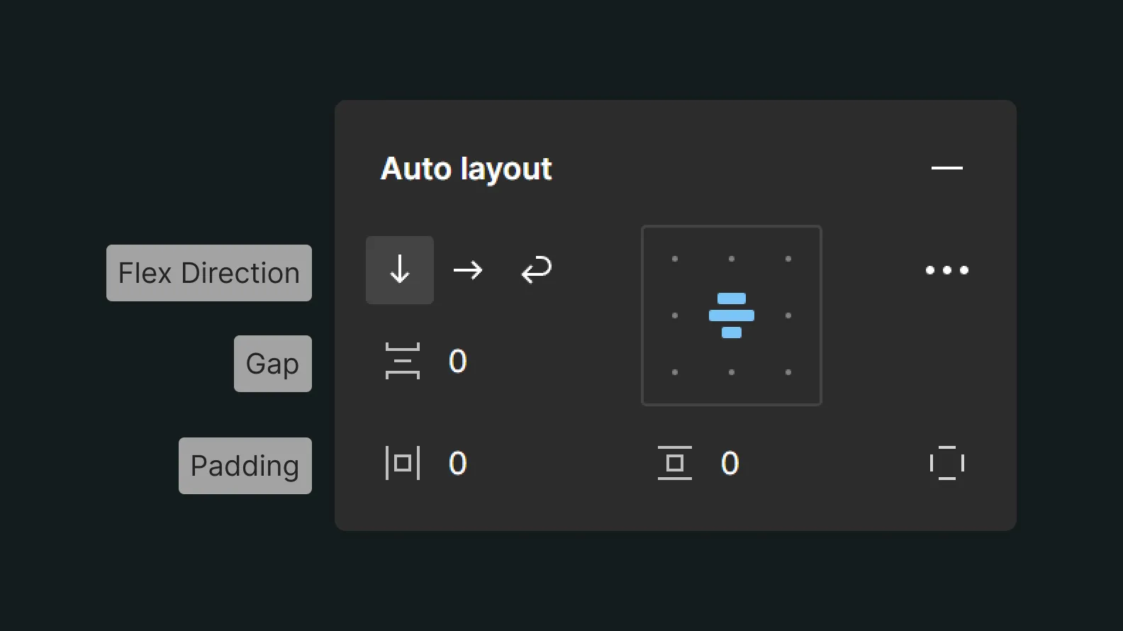
The auto layout settings within Figma expose some elements of the box model within the design tool space.
The auto layout direction feature is a pretty direct mapping to the flex-direction CSS property. Within a display: flex container this setting determines the direction in which elements of the parent stack, vertical or horizontal. The wrap feature is a reflection of the flex-wrap: wrap setting for horizontal flexbox elements.
The Horizontal Gap and Vertical Gap settings in this panel are similarly a direct mapping to the gap property within flex and grid containers in CSS. As shown in the example above, this gap property determines the space between elements, without affecting the spacing to the left/right or top/bottom.
Finally the Horizontal Padding and Vertical Padding options are, as their name suggests, representations of the padding property in CSS. When viewed in dev move Figma is using the shorthand padding property, but it’s easy enough to understand that Horizontal Padding is padding-inline, and Vertical Padding is padding-block.
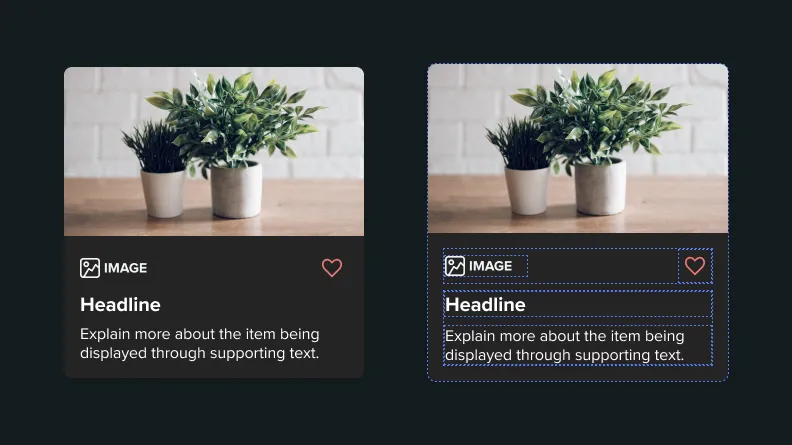
Borders in Auto Layout
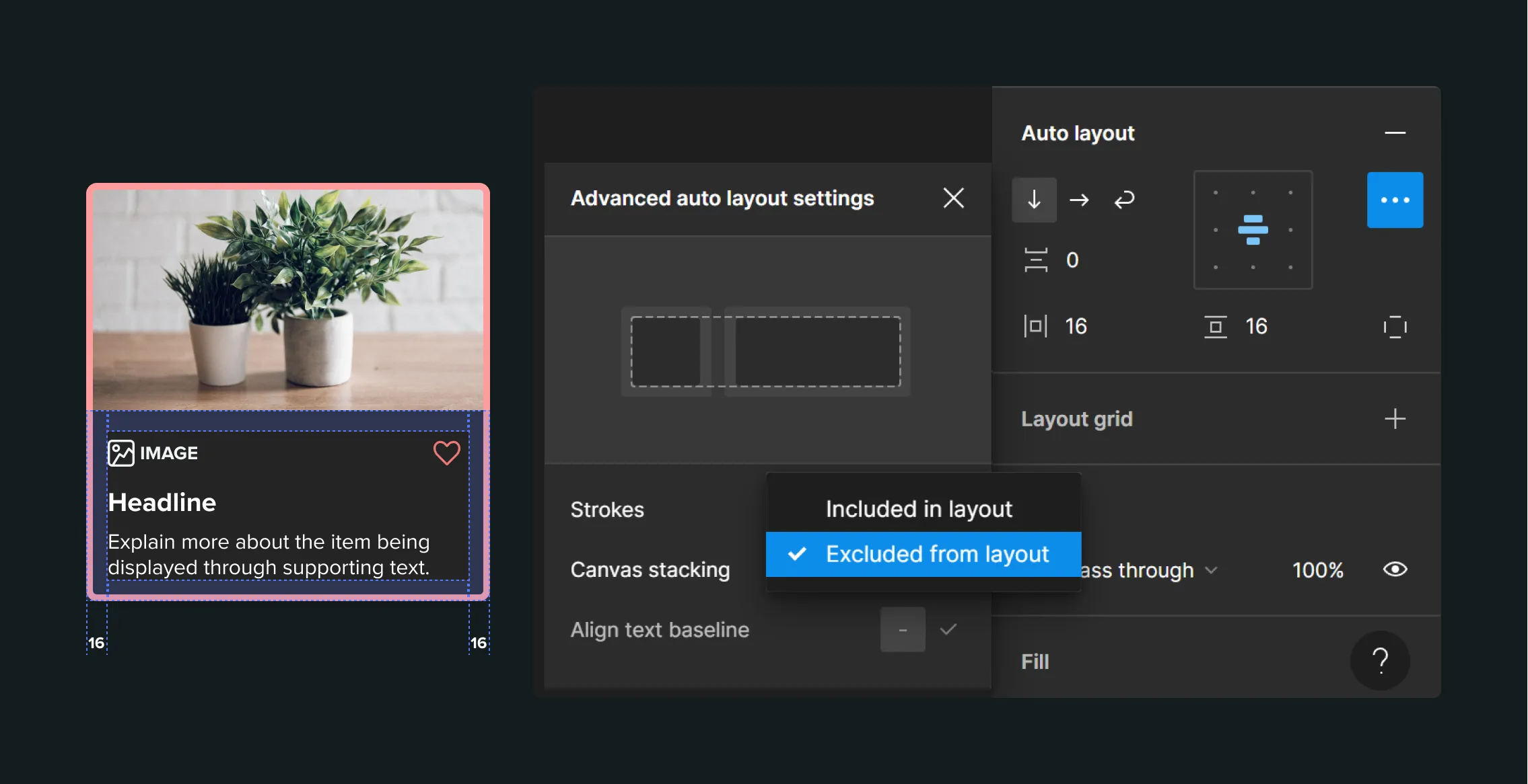
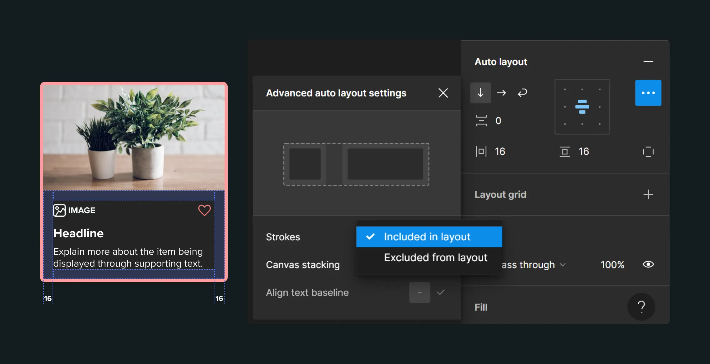
Another feature of the auto layout system within Figma is the ability to determine whether strokes are included in the spacing calculations for your auto layout. This feature is a pretty good analog for visualizing and understanding how different box models calculate spacing.
By default in Figma strokes are not included when accounting for the size calculations of objects. From Figma’s own docs:
By default, strokes aren’t accounted for when calculating the size of objects, and thus don’t affect their parent frame or surrounding siblings.
This may not be ideal during developer handoff, as it doesn’t accurately represent how CSS renders borders.
In the image below you can see how the 16 pixels of spacing overflows and sits on top of the border.
By contrast, in the next image you can see how the 16 pixels of space is calculated inside the borders. This is because the borders are being included in the width calculation. This operates similarly to the border-box model mentioned above.
Beyond the Basics
In this introduction we’ve explored the basics of what the box model is, how we can use boxes to construct interfaces and components, and a representation of one model within Figma.
We briefly touched on the concepts of Margin, Padding, Gap, and different layout models like flexbox and grid, I encourage you to learn more about these CSS layout properties as they’re the foundational tools we use to construct page layouts. Understanding more about how interfaces come together can highlight potential challenges to something that may appear easy in a design tool, or bring to light new and interesting ways to explore in design.
Design on the web has always been incredibly unique and diverse, and as we gain new features and tools for creating layouts and interfaces it becomes increasingly important to understand the underlying principles and technologies that power it. Hopefully this article helps you understand a little bit more about what the box model is and how we use it to build the web.