Showcasing Creativity
Responsibilities
The objective of the DE Create project was to create the branding, website, and digital assets for Discovery Education’s first internal design “mini-conference.”
I was responsible for the creation of the brand identity and the execution of digital assets and website.
Problem Statement
This was Discovery Education’s first foray into hosting a large design-focused internal event.
We needed to create a brand identity, digital resources, and event website all within the span of roughly 3 months.
The north star for the project was the desire to highlight all of the amazing work that happens “behind-the-scenes” in the creation of our products and educational resources; something we affectionatly call the DE Magic.
A few of our key metrics for success were:
- Establishing a brand identity for the event
- Ideally above 50% employee engagement
- Increased employee satisfaction
Looking for Inspiration
The event working group came together to discuss and identify what kind of identity we wanted the event to have. We wanted to ensure that the branding could express a sense of the joy and wonder of creativity, while remaining aligned to our core identity as an education company.
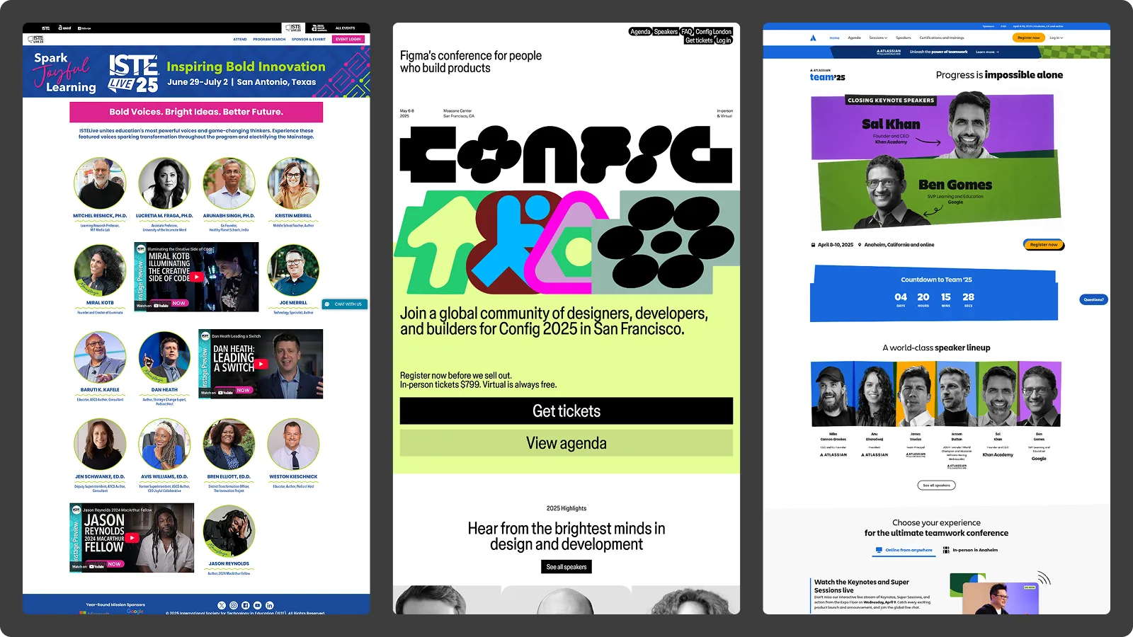
We took inspiration from around the internet, looking at how brands like ISTE (an educational conference) as well as popular design and professional conferences like Figma’s Config and Atlassian’s Team.
Defining our Identity
Having a name a great, but what does that name look like?
This is the question we set out to solve with the exploration of logos and visual identity.
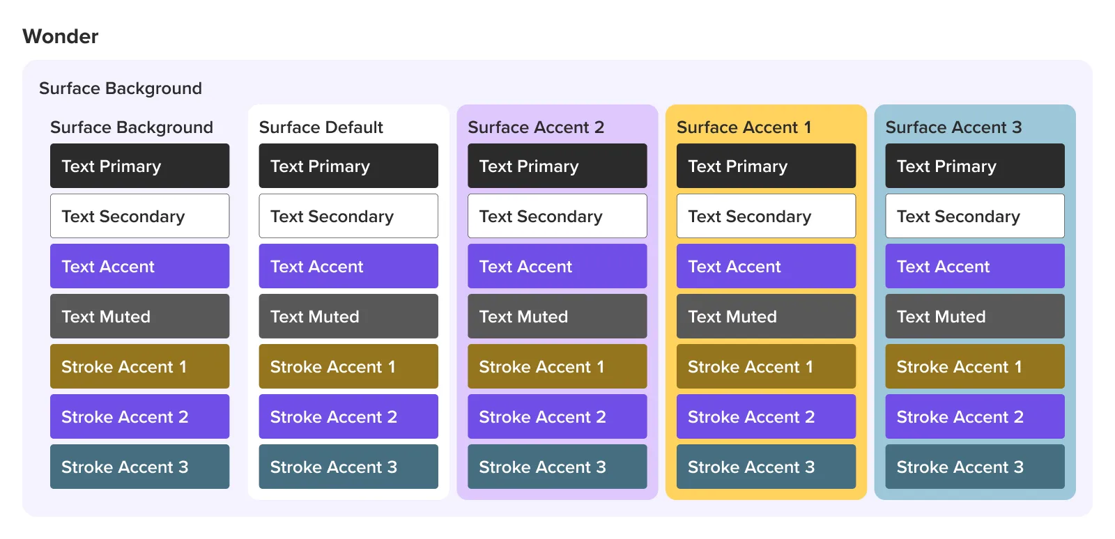
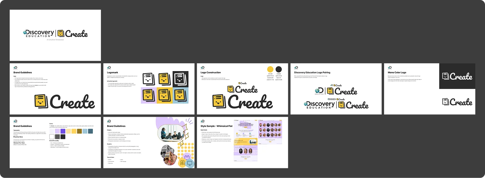
We explored multiple color palettes before landing on what we now refer to as Wonder, our palette of purple, yellow, and teal. We felt this palette best evoked the feeling of joy and wonder that we were looking for.
The overall visual styling of the brand went through many explorations. Using a mock homepage as an exploratory surface we exampled styles of brutalism, minimalism, bauhaus, and more.
Along with the visual style we explored many logo styles to match. Some leaned further into creative type styles while others were more subdued.
![]()
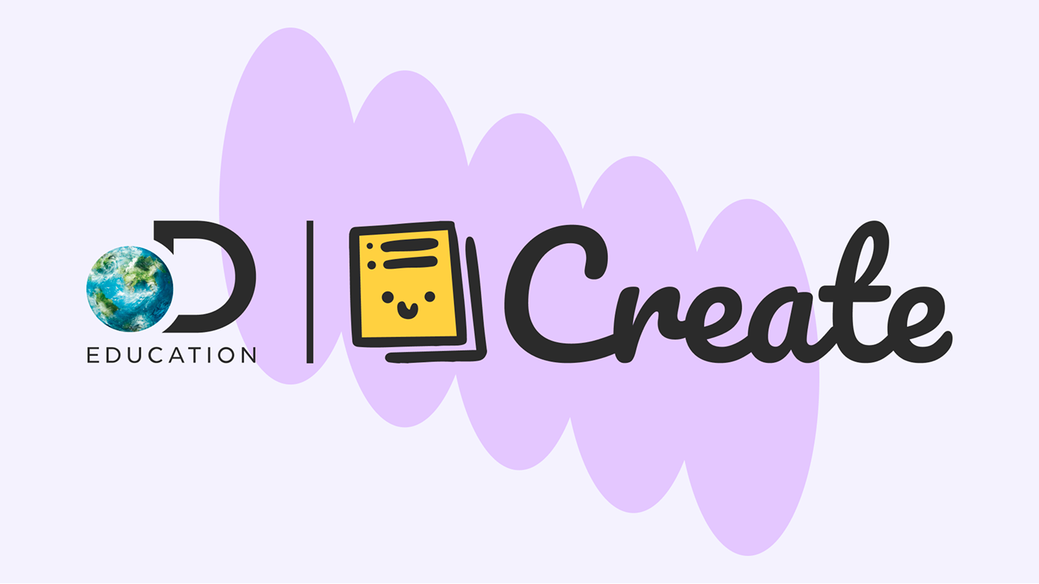
We ultimately landed on Pacifico for it’s cursive-like style, a nod to both learning to write, and the creativity individuals can have in their writing style.
Documenting Decisions
Once the explorations were completed we set out to establish a brief reference document that would be used for the brand. Among other things this document included a full breakdown of logo usage as well as typography, color palette, and graphic guidelines along with a style sample.
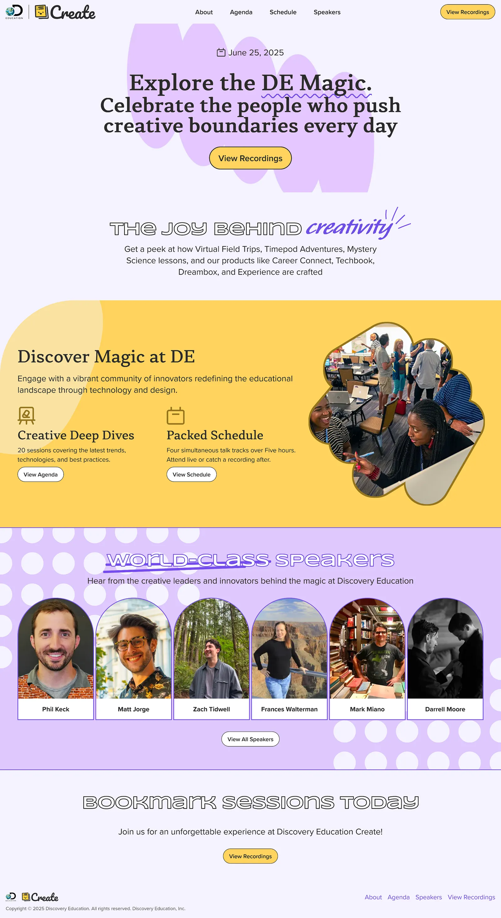
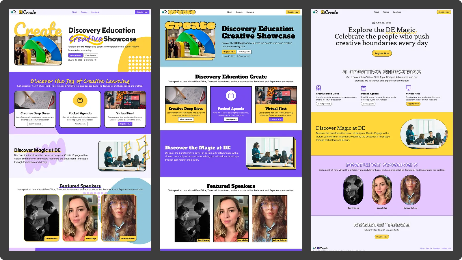
DE Create
The event was held on June 25th to great success. I’m incredibly proud of the amount of work that got accomplished in a short amount of time. The event planning and hosting team pulled together to ensure that our speakers were well prepared and that everything would run smoothly.
In the end we managed to meet or exceed all of our goals:
- We etablished a brand identity that we can build on and reuse for future events.
- We had 250 registrations and over 1500 livestream views.
- Both speakers and attendees were extremely satisfied with the event.